
project details
Event Registration Website
Making It Easy to Explore, Participate, and Grow
(Full Case Study)
5+
Team Members
3+
Design Tools
180+
Hours
25+
Screens
50+
Components
5
Usability Tests
Role
- UX/UI Design Lead
Responsibilities
- User Flow
- Information Architecture
- Wireframes
- UI Design
- Prototype
Tools
- Adobe Illustrator
- Adobe Photoshop
- Adobe Firefly
- Midjourney
- Slack
- FigJam
- Figma
Team
- Minoo S.
- Freya M.
- Fay R.
- Nassi B.
- Kathy K.
Client
- Yes, M.I.S.S. Inc.
Project Overview
This project developed a user-friendly website that helps users find events, register for workshops, volunteer, and make donations easily.
Yes, M.I.S.S. Inc. is a 501(c)(3) nonprofit that aims at equipping and empowering high school girls with the tools and support to pursue their God-given purpose in the marketplace and their communities.
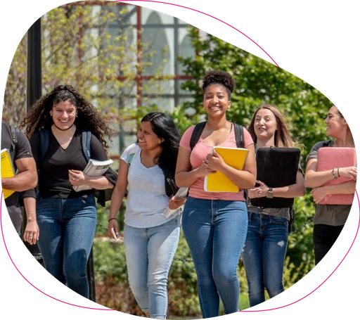
Currently, Yes, M.I.S.S. serves students in New Jersey from Bergen, Essex, Passaic, and Union Counties. The organization advances college and career choices for young women through a continuum of mentorship, real-world life skills, and positive youth development. They are collaborating with colleges to encourage participants to pursue competitive degrees.
The Problem
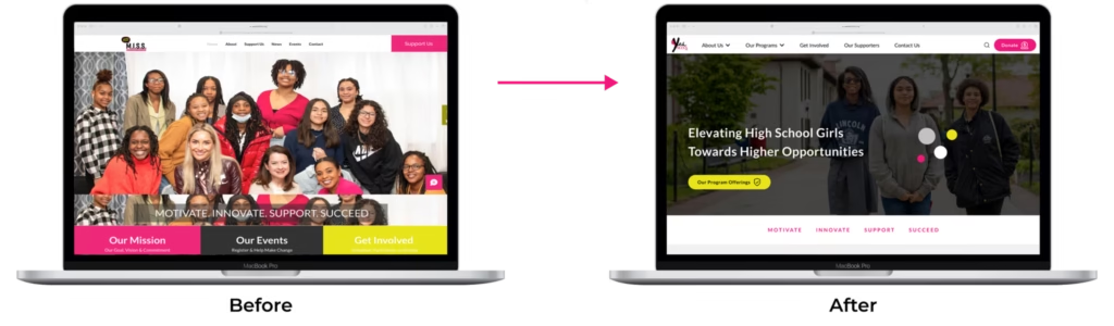
It looks difficult for high school girls to interact with Yes, M.I.S.S. website and access the support they need. On the other hand, there is currently no way to display upcoming events and workshops on the website. Also, there is not enough assistance for volunteers and supporters on the website.
The Goal
The project aimed to achieve the following key goals:
- To have a user-friendly website that conveys the organization’s mission
- To allow users to easily find and register for events and workshops
- To encourage users to volunteer for different programs, supporting the organization’s growth
- To facilitate donations that used for the organization's expenses
The Solution
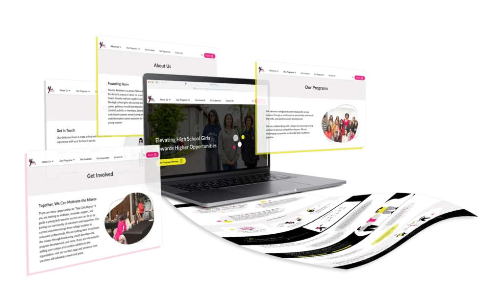
The solution delivered an intuitive website that clearly communicates the organization’s mission and makes it simple for users to explore events, register, volunteer, and donate within a cohesive experience.
The Product
The redesigned Yes, M.I.S.S. website
Impact
This project made a positive difference by:
- Increased user engagement by making event registration and volunteering more accessible.
- Improved clarity of the organization’s mission, helping to build stronger community connections.
- Streamlined the donation process, encouraging more supporting the organization.
- Empowered users to participate actively in programs, and fostering long-term involvement.
Research
By uncovering key opportunities, we aligned the product vision with real user needs.
Meeting the Stakeholders
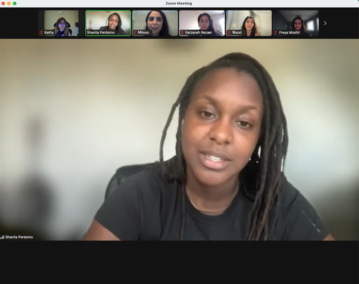
We began the project with stakeholder interviews, crucial for understanding the problem, goals, and shaping our UX process. During these discussions, the stakeholders expressed their specific desires for the website:
- Registration for events and workshops
- Easy and clear way for donors to contribute
- Volunteers to sign up
- Reflect the quality of the program and convey our mission
"I would like to provide the ability for volunteers to sign up."
“Consider a clear way for users to register for events and workshops.”
"It is important to include an easy and clear way for donors to contribute to the organization."
“I would like this website to reflect the quality of the program and convey our mission.”
Who Are We Designing For?
To answer this question, we collaborate closely with project stakeholders to craft the persona. This persona offers valuable insights into users characteristics, motivations, and pain points, enabling us to tailor solutions that effectively meet their needs. The following section presents the persona that informed and guided our project decisions..

Sara, 17 year
High School Student
Lives in New Jersey, USA
Sara is a 17-year-old high school student who’s passionate about personal growth and believes in the power of girls. She actively searches for workshops, career tours, and college visits to uncover the array of opportunities awaiting her future.
Goals
- Program Information Quest: Sara's primary goal is to proactively seek out comprehensive information about various workshops, career tours, and college visits. She aims to gather insights into program details, schedules, and offerings to make informed decisions.
- Enrollment and Participation: Sara's secondary goal is to efficiently register and actively participate in the identified programs. She aims to seamlessly navigate the registration process and engage in the opportunities she's interested in.
Pain Points
- Lack of Clear Information: Sara might encounter difficulties due to incomplete or unclear information about the workshops, career tours, and college visits. Insufficient details could hinder her ability to make confident choices.
- Complex Registration Process: If the registration process for the programs is convoluted or time-consuming, Sara might feel discouraged from enrolling in the opportunities she's eager to be a part of.
Understanding the Current Experience
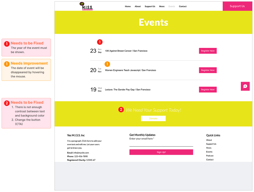
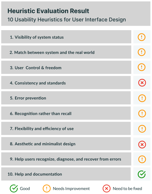
We performed a comprehensive website audit of the existing platform, evaluating it based on Heuristic Evaluation rules. Our evaluation encompassed key aspects such as usability, navigation, visual design, and overall user experience. The findings were documented in a detailed report, highlighting strengths, weaknesses, and recommendations for improvement. This audit served as a valuable tool in identifying areas of optimization and guiding our design decisions for an enhanced user-centric website showcase.
Standing Out by Looking Around
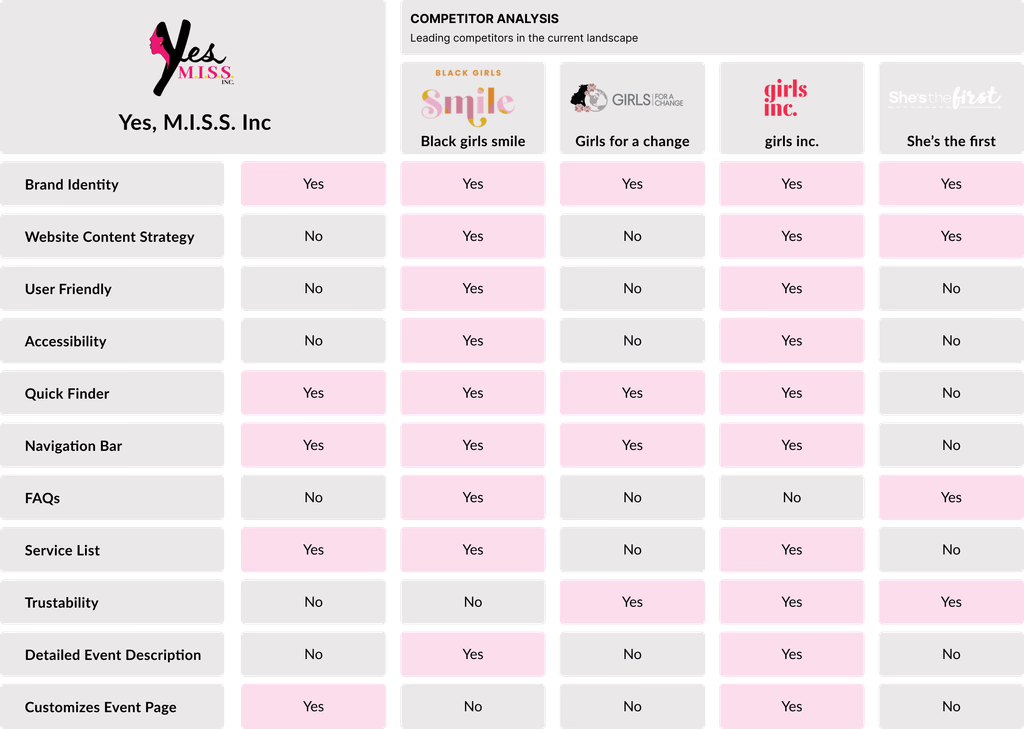
Our team conducted a competitor analysis, thoroughly analyzing the websites of key competitors:
Black girls smile
Girls for a change
girls inc.
She’s the first
What can we learn?
This comprehensive evaluation allowed us to gain valuable insights into the landscape and identify areas of opportunity. To facilitate our findings, we compiled the results in a concise table that highlights the presence of features across each competitor’s website.
By leveraging this analysis, we were able to strategically position the Yes, M.I.S.S. website showcase to outshine the competition and deliver a superior user experience.
Design
Through flows, sitemaps, and prototypes, we translated research into a thoughtful, functional experience.
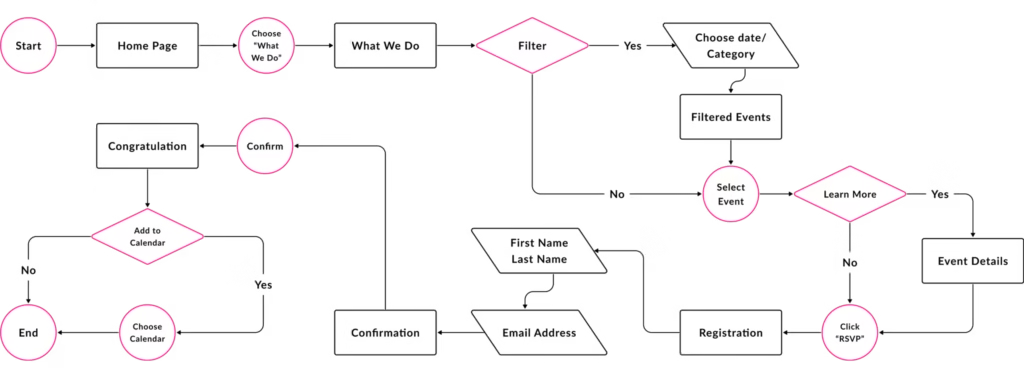
What Path Do Users Take?
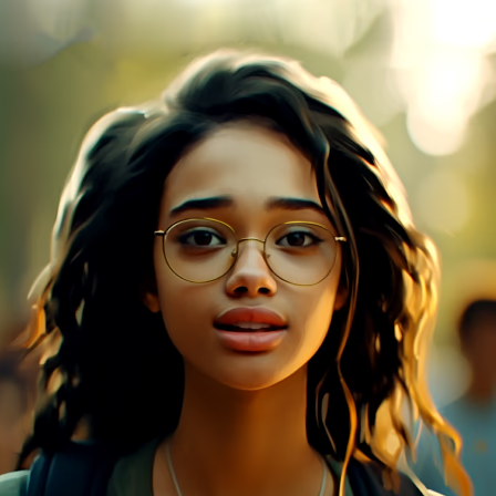
What's the way to get info on my fav program and actually sign up?
How Is the Website Structured?
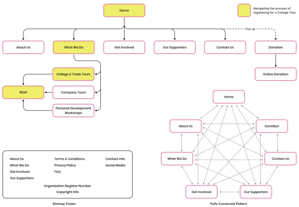
After designing the user flows based on user’s needs, we have created the new sitemap. This sitemap outlines the main sections and navigation flow of the website, including the Home, About Us, Our Programs, Get Involved, Our Supporters, Contact Us, and Donations which are fully connected to each other.
Laying the Foundation with Wireframes
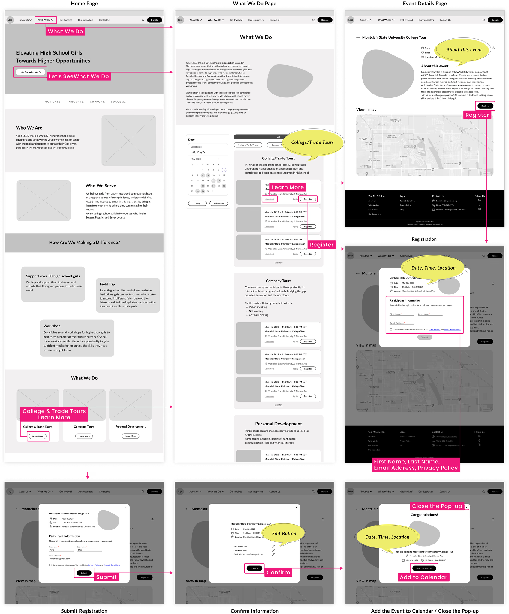
After finalizing the sitemap, we created wireframes, transforming concepts into visual representations. Considering user expectations, these wireframes provided comprehensive information for events and a clear roadmap for the website, ensuring a seamless, easy, and engaging user experience.
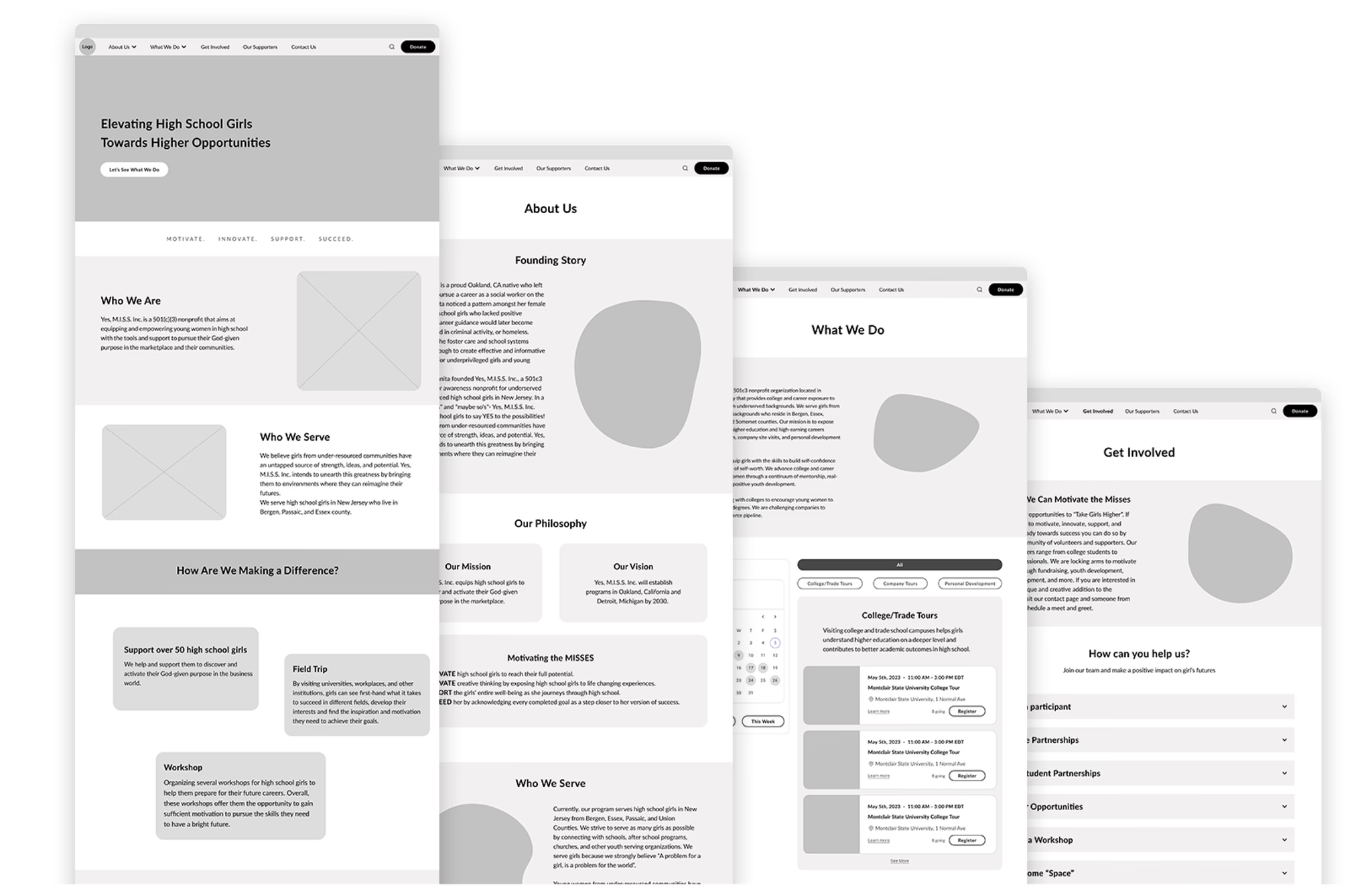
Here is Sara’s journey to register for one of the College and Trade Tours, along with the supporting website wireframes.
I'm sooo ready to explore everything about my fav program and, get myself all set up!
Interactive Draft for Early User Testing
After creating the wireframes, we moved forward to the mid-fidelity prototype, taking the website design to the next level. This stage brings the wireframes closer to their final form, incorporating interactive elements and functionality.
Try the prototype here ↓
TEST
We used insights from real users to guide refinements and confirm design choices.
How Will Users Interact With the Design?
After creating the mid-fi prototype, we conducted a moderated usability test to figure out how easy users can complete the order process.
Study Type
Conversion rate
Participants
3 high school students
3 parents
Location
United States (Remote)
Length
15–20 min per session
Key Findings from Usability Testing
Strengths Found
- Most users found and registered for a program quickly
- All users enjoyed navigating between sections
- All users found the layout clean and clear
Areas for Improvement
- A few users encountered difficulty in finding desired program.
User Recommendations
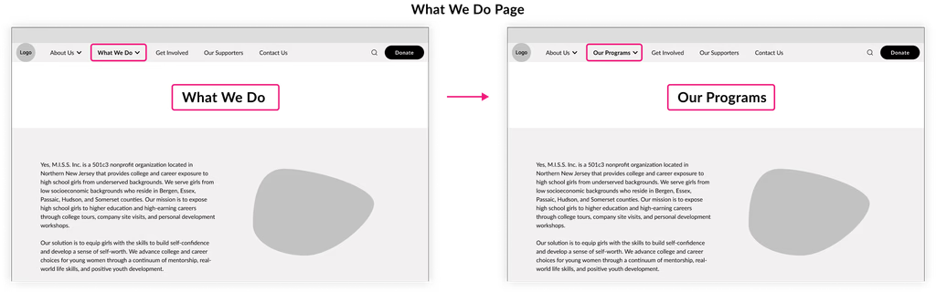
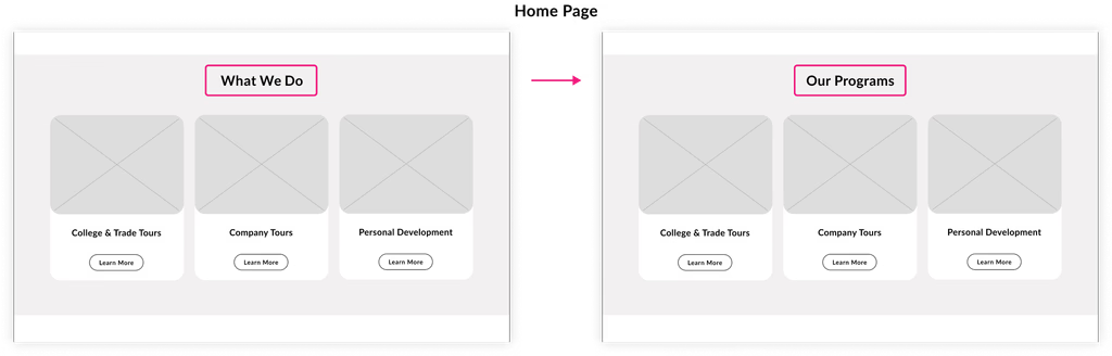
- Users suggest to revise the "What We Do" name to "Events" or "Programs".
- Users would like to have a dedicated FAQ section designed for events.
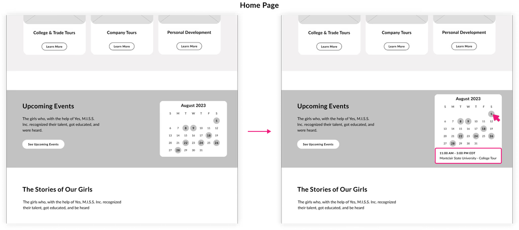
- Users would like to interact with the Home Page calendar to see events of each day.
From Feedback to Final Touches
In order to enhance the design for meeting user needs, we applied the following changes based on the findings from the usability test:
Substituting What We Do with Our programs
We changed the “What We Do” section name to “Our Programs” throughout the website

Making the Home Page Calendar clickable
We made the Home Page Calendar clickable to show the program details under the calendar on the Home Page.
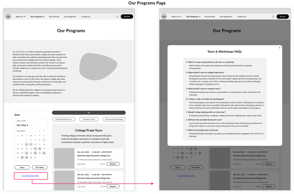
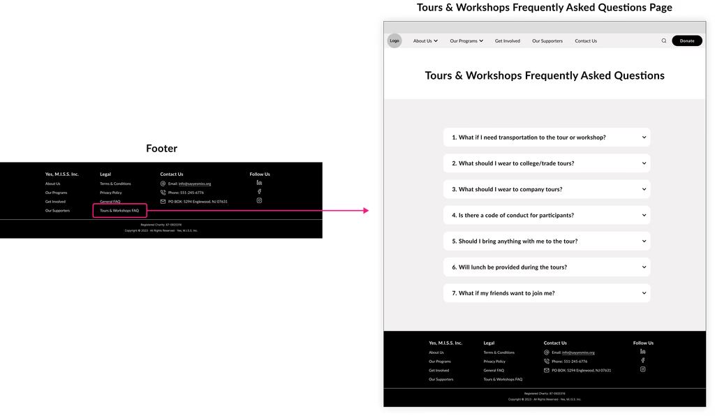
Designing a dedicated FAQs for Programs
We designed a dedicated FAQs page and pop-up for Tours & Workshops. Then we added a link to:
the Tours & Workshops FAQs pop-up on the Our Programs page
the Tours & Workshops FAQs page on the Footer
USER INTERFACE
Using well-designed UI elements, we shaped a visual language that makes interaction clear and engaging.
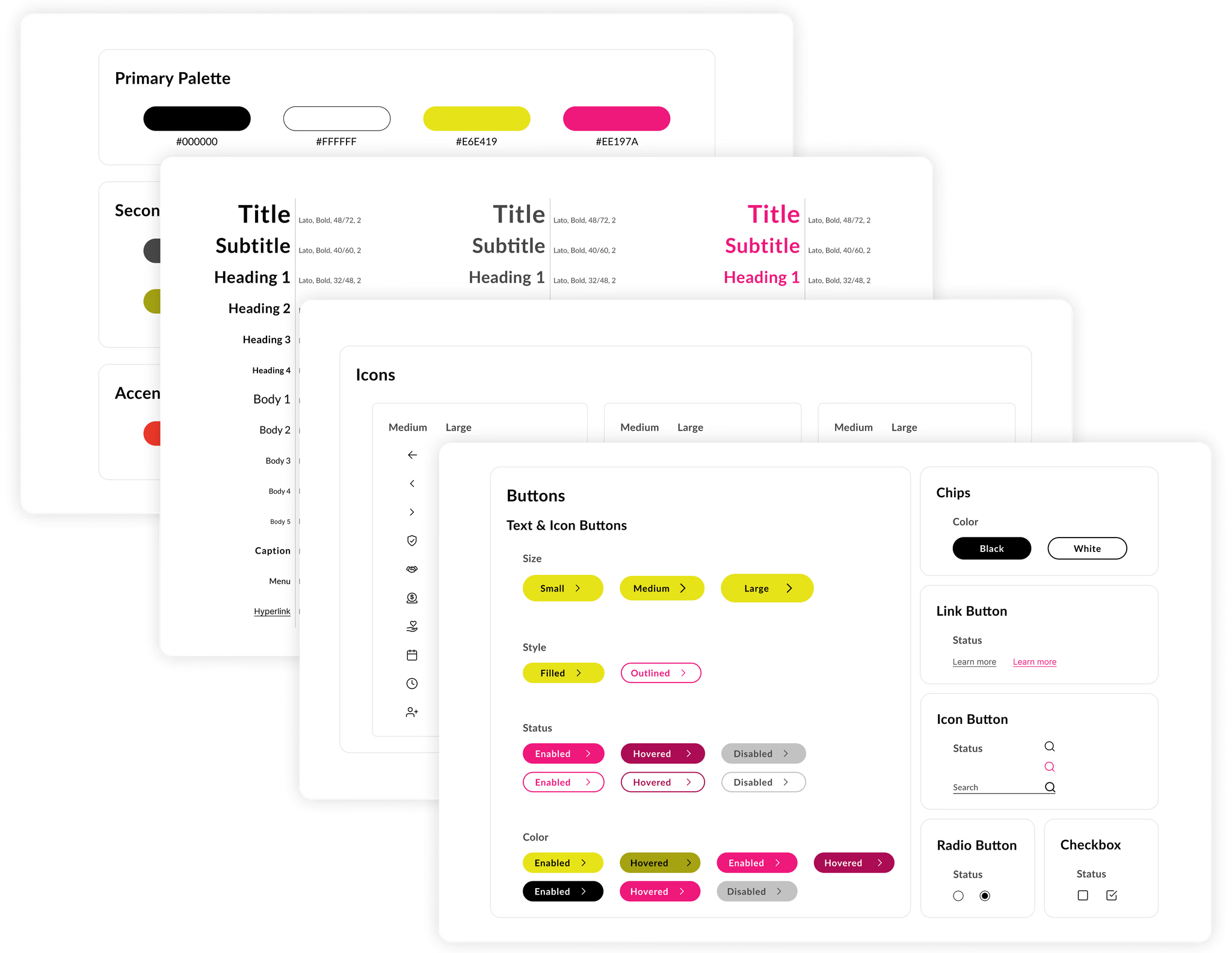
Crafting Consistent UI Elements
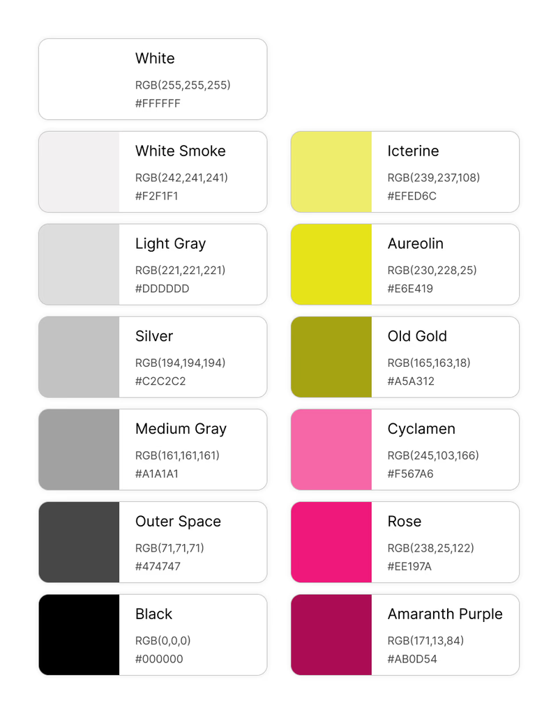
In designing the user interface (UI) elements, we took a thoughtful approach to align with the target audience and the branding guidelines. The primary users being high school girls, we employed a color scheme that reflects their interests and preferences. The color branding included vibrant and energetic tones such as Amaranth Purple, Rose, Cyclamen, Old Gold, Aureolin, and Icterine.
Color Accessibility
Prioritizing inclusivity, we carefully reviewed our color combination to ensure strong contrast. This ensures our designs are not only visually pleasing but also accessible to all users, promoting a seamless user experience for everyone.
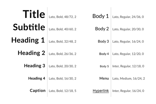
We adhered to the typography guidelines outlined in the branding style to maintain consistency. The chosen typography is modern, clean, and easy to read, enhancing legibility and overall user experience.
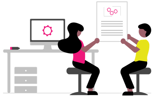
To capture the attention of our target users, we utilized modern and dynamic illustrations that resonate with their youthful spirit.
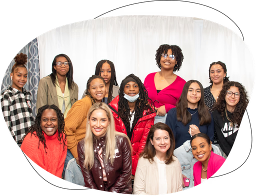
Simultaneously, we recognized the importance of instilling trust in parents, supporters, and volunteers. To achieve this, we incorporated real photos that lend authenticity and credibility to the interface.
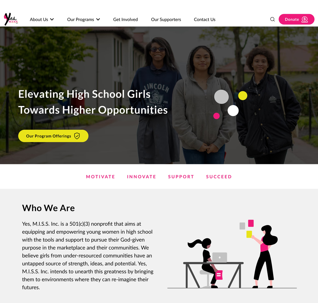
To strike a balance between vibrancy and visual harmony, we opted for a predominantly monochromatic color palette, utilizing black, white, and various shades of gray. The vibrant branding colors were intentionally reserved for sections that required the most attention, ensuring essential elements stand out effectively.
By carefully blending these design choices, we crafted an interface that not only captures the attention of our target users but also instills trust and ensures a visually appealing and cohesive experience for all stakeholders.
How does the final design take shape?
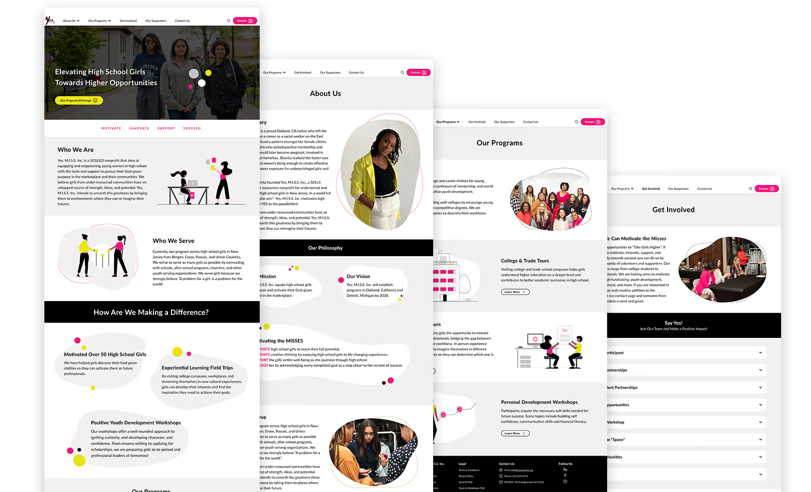
We designed mockup pages to demonstrate how new UI elements come together to create the optimal appearance and user experience.
How do we maintain UI consistency?
We have developed a comprehensive UI Kit acts as the foundation of our website showcase. This collection includes reusable components and guidelines that ensure visual consistency and efficiency throughout the design process. By establishing a unified framework, we have achieved a harmonious and seamless user experience across different pages and screens.
User Journey on Hi-Fi Design
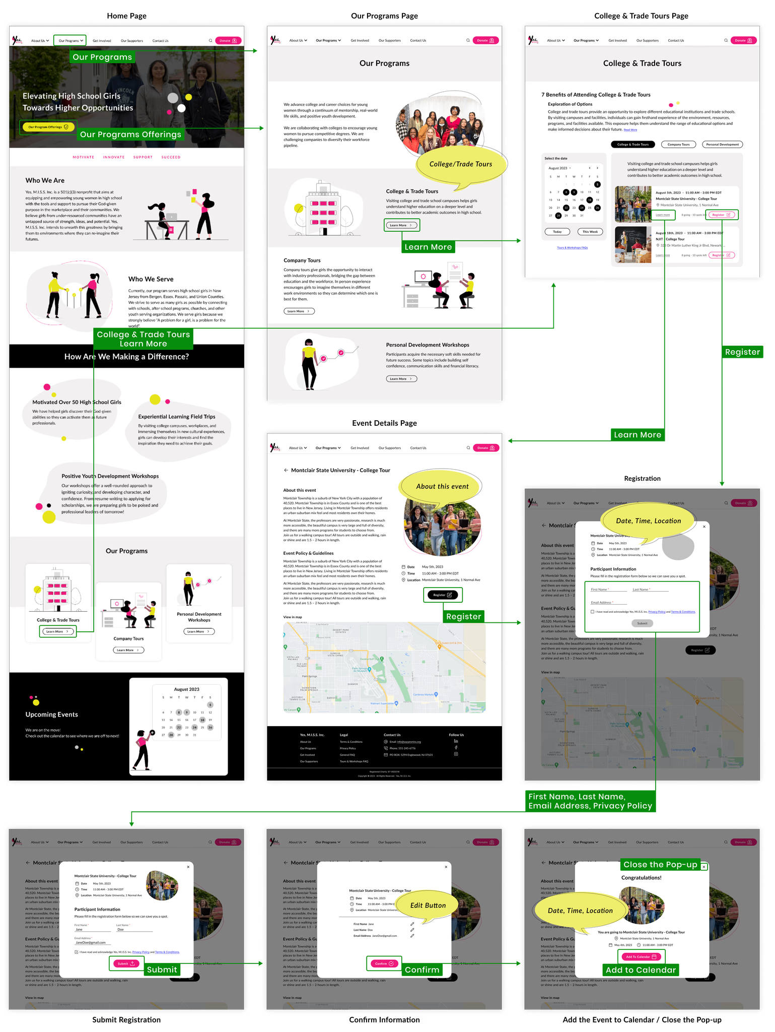
The transition to high-fidelity design elevates Sara’s registration process for College & Trade Tours. The polished user interface, accompanied by well-chosen UI elements, ensures seamless navigation. This transition not only enhances the user experience but also provides stakeholders with a concrete understanding of the registration journey and its visual polish.
Here is the flow that Sara follows to register for a College & Trade Tours, along with the high fidelity design.
Ready to rock this registration process and I'm totally pumped to dive in!
FINAL PRODUCT
We crafted a polished product designed for clarity and impact, guided by user feedback and final refinements.
Bringing Design Interactions to Life
To evaluate the functionality and interaction between pages in the design, we created the high-fidelity prototype using Figma.
Try the prototype here ↓
Final User Feedback and Usability Insights
After the development of the high-fidelity prototype, we conducted an additional usability test to assess how users would navigate and register for their favorite program at this particular stage.
Insights
During and after the test, the following observations underline the user experience:
High user satisfaction across the overall experience
Seamless navigation through the intended steps
Positive engagement, driven by a clean and modern interface
Efficient task completion enabled by a focused, to-the-point flow
Well-received user experience shaped by a user-centric design
Guess what?
I can now easily know all about my fav program and join in without any hassle!
Delivering the Final Product
The result of this journey is the final prototype, achieved through a process of precise usability testing and iterative refinement. This method ensures user-friendliness and alignment with project goals.
TAKEAWAYS
This journey not only shaped the outcome but also strengthened my approach to problem-solving, collaboration, and designing with intention
Overcoming Key Challenges
Leading the Yes, M.I.S.S. Inc. website redesign project involved navigating challenges such as remote collaboration and time zone differences. Addressing these complexities required meticulous planning and strong problem-solving skills. These experiences fostered growth, strengthened leadership capabilities, and ultimately contributed to the project’s success.
Working within Technical Constraints
Throughout this project, we faced significant technical constraints that influenced our approach. Adhering to established Branding Guidelines governed our color schemes, typography, and overall visual identity, ensuring consistency but limiting creative freedom. We also encountered limitations with the Wix platform, leading us to navigate its functionalities and rely on available features and plugins instead of custom solutions. Despite these challenges, we innovated within these parameters to deliver a user-friendly and visually appealing final product.
What I learned
This project was a unique experience for me. Alongside leading the team, I engaged in remote collaboration with a UX Researcher and three UX/UI Designers. Despite living in different time zones and having varying schedules, we all united with a common goal: supporting a women-focused institution of the future. This shared mission prompted us to combine even the tiniest pockets of our available time to collaborate and learn together and I learned:
Even small minutes can be used in the best way for significant goals.
By finishing this project, not only did we support young girls, but we also learned and enriched ourselves.
Impact
This project made a positive difference by:
Increased user engagement by making event registration and volunteering more accessible.
Improved clarity of the organization’s mission, helping to build stronger community connections.
Streamlined the donation process, encouraging more supporting the organization.
Empowered users to participate actively in programs, and fostering long-term involvement.